Matplotlib是Python的一个工具包,提供了丰富的绘图方案,主要用于绘制一些统计图形。现将网络上多个学习Matplotlib的总结搬运至此,留作备忘。
前言
Matplotlib中函数的调用方式大致和Matlab一致的
简单绘图中,使用最多的是matplotlib.pyplot.plot函数
from pylab import * 会导入 np,
mpl,
plt等模块,甚至可以直接使用plot()函数而不是使用plt.plot()。ipython --pylab
使用--pylab参数启动ipython,(或者进入ipython之后,输入%pylab
),这个参数允许使用matplotlib交互式绘图。import matplotlib 之后输入
matplotlib.use('agg')。此后,使用 plt.plot()
则不会显示图片,可通过 plt.savefig() 保存图片。matplotlib
color maps markers seaborn
plotting python-graph-gallery
基础
1
2
3
4
5
6
7
8
9
10
import numpy as np import matplotlib as mpl import matplotlib.pyplot as plt from matplotlib.font_manager import FontProperties from matplotlib import rcParams font0=FontProperties() x=np.linspace(-np.pi,np.pi,256,endpoint=True) C,S=np.cos(x),np.sin(x)
使用默认的绘图属性
1
2
3
4
5
6
7
8
9
10
plt.plot(x,C) # 默认为 lines plt.plot(x,S) plt.show() plt.plot(x,C,x,S) # 同时画多条线 plt.show() plt.plot(x,C,'.') # 只画点,不画线 plt.show()
Grid, legend, and axis
1
2
3
4
5
6
7
8
9
10
11
12
13
14
plt.grid(True) plt.plot(x,C) plt.show() plt.plot(x,C,label=r'cos($t$)') # LATEX 公式 plt.legend() # 调整坐标轴(axis)范围 plt.axis() # 输出 [xmin, xmax, ymin, ymax] plt.axis([-4, 4, -1, 1]) # 改变取值范围 # 调整坐标轴(axis)范围 plt.xlim(-4, 4) plt.ylim(-1, 1)
1
2
3
4
plt.xlabel('Time (s)', fontsize = 10) plt.ylabel('Y-axis values', fontsize = 10) plt.title('TITLE', fontsize = 10)
刻度(ticks)
1
2
3
4
5
plt.plot(X,C) plt.yticks([-1.0,-0.5,0,0.5,1.0]) plt.xticks(np.arange(-3,3.1,1), ['a','b','c','d','e','f','g']) # 自定义 plt.xticks() # 不画刻度
边框(spines)和刻度(ticks)的位置
边框(spines)是围绕着图像边界的线,分为上下左右四个边框。通过将它们的颜色设置成None,可以来调整是否显示边框。
1
2
3
4
5
6
7
8
9
10
11
12
13
14
15
16
17
18
19
20
21
22
#### 边框 fig=plt.figure() ax = fig.add_subplot(111) plt.plot(x,C) ax.spines['right'].set_color('none') # 不显示右边框,right, left, top, bottom ax.spines['bottom'].set_position(('data',0)) # 设置位置,right, left, top, bottom #### 刻度 ## 对应x轴 1,2分别表示下和上;y轴 1,2分别表示左和右 for t in ax.xaxis.get_major_ticks(): t.tick1On = True t.tick2On = False for t in ax.yaxis.get_major_ticks(): t.tick1On = True t.tick2On = False ax.xaxis.set_ticks_position('bottom') # 设定x轴tick在底部 ax.yaxis.set_ticks_position('left') # 设定y轴tick在左边 ax.yaxis.set_label_position('right') # 设定y轴label在右边
保存到图片
1
2
3
4
5
6
7
8
9
10
默认值: an 8x6 inches figure with 100 DPI results in an 800x600 pixels image # 自定义图片大小和分辨率 rcParams['figure.figsize']=(6.4,4.8) # [8.0, 6.0] rcParams['savefig.dpi']=300 # 100 plt.savefig('plot123.png') plt.show() plt.savefig('plot123_2.png', dpi=200) # 设置 dpi=200,分辨率变为1600×1200
Markers and line styles
Marker是指形成线的那些点,plot通过第三个string参数可以用来指定Colors,Line
styles,Marker styles。可以用string format单独或混合的表示所有的style。
1
2
plt.plot(x,C,'cx--', x,C+1, 'mo:', x,C+2, 'kp-.'); plt.show()
keyword参数进行更多的个性化:
1
2
3
4
5
6
7
8
9
10
Keyword argument Description color or c Sets the color of the line;accepts any matplotlib color. linestyle Sets the line style;accepts the line styles seen previously. linewidth or lw Sets the line width;accepts a float value in points. marker Sets the line marker style. markeredgecolor Sets the marker edge color;accepts any matplotlib color. markerdegewidth Sets the marker edge width;accpets float value in points. markerfacecolor Sets the marker face color;accpets any matplotlib color. markersize Sets the marker size in points;accepts float values.
1
2
3
4
5
6
7
8
9
10
11
12
13
14
15
16
17
18
19
20
21
22
23
24
25
26
27
28
29
30
31
32
33
34
35
36
37
38
39
40
41
42
43
44
45
46
47
#### 线条的颜色 character color 'b' blue 'g' green 'r' red 'c' cyan 'm' magenta 'y' yellow 'k' black 'w' white #### 线条的style character description '-' solid line style '--' dashed line style '-.' dash-dot line style ':' dotted line style #### Marker的style '.' point marker ',' pixel marker 'o' circle marker 'v' triangle_down marker '^' triangle_up marker '<' triangle_left marker '>' triangle_right marker '1' tri_down marker '2' tri_up marker '3' tri_left marker '4' tri_right marker 's' square marker 'p' pentagon marker '*' star marker 'h' hexagon1 marker 'H' hexagon2 marker '+' plus marker 'x' x marker 'D' diamond marker 'd' thin_diamond marker '|' vline marker '_' hline marker
Text
1
2
3
4
5
6
plt.text(x, y, s, fontdict=None, withdash=False, color='k', fontsize=12, bbox=dict(facecolor='red', alpha=0.5)) 其它参数 https://matplotlib.org/api/text_api.html#matplotlib.text.Text plt.plot(x, C) plt.text(0, 1.01, 'cos(0)=1',verticalalignment="bottom",horizontalalignment="center")
annotations and arrows
一般可以使用plt.text()写出注释内容,然后用plt.annotate()添加箭头,用于标注一些感兴趣的点。
1
2
3
4
5
6
7
8
9
10
11
12
13
14
15
16
17
18
19
20
21
22
23
24
25
26
27
28
29
30
31
32
33
34
35
36
37
38
39
40
41
plt.plot(x, C) plt.text(0, 0.5, 'cos(0)=1',verticalalignment="top",horizontalalignment="center") plt.annotate('',xy=(0,0.98),xytext=(0,0.5),arrowprops=dict(arrowstyle="->",connectionstyle="arc3",color='red',facecolor='black')) 其中,xy 表示箭头终点的坐标,xytext 表示箭头起点的坐标,arrowprops 表示箭头的属性。 箭头种类 plt.xlim(0,10) plt.ylim(0,20) arrstyles = ['-', '->', '-[', '<-', '<->', 'fancy', 'simple','wedge'] for i, style in enumerate(arrstyles): plt.annotate(style, xy=(4, 1+2*i), xytext=(1, 2+2*i), arrowprops=dict(arrowstyle=style)) connstyles=["arc", "arc,angleA=10,armA=30,rad=15", "arc3,rad=.2", "arc3,rad=-.2", "angle", "angle3"] for i, style in enumerate(connstyles): plt.annotate("", xy=(8, 1+2*i), xytext=(6, 2+2*i), arrowprops=dict(arrowstyle='->', connectionstyle=style)); 一个例子: 我们选择2π/3作为我们想要注解的正弦和余弦值。我们将在曲线上做一个标记和一个垂直的虚线。然后,使用annotate命令来显示一个箭头和一些文本 t = 2*np.pi/3 plt.plot([t,t],[0,np.cos(t)], color ='blue', linewidth=2.5, linestyle="--") plt.scatter([t,],[np.cos(t),], 50, color ='blue') plt.plot([t,t],[0,np.sin(t)], color ='red', linewidth=2.5, linestyle="--") plt.scatter([t,],[np.sin(t),], 50, color ='red') plt.annotate(r'$sin(\frac{2\pi}{3})=\frac{\sqrt{3}}{2}$', xy=(t, np.sin(t)), xytext=(2.095,0.9), fontsize=16, arrowprops=dict(arrowstyle="->", connectionstyle="arc3,rad=.2")) plt.annotate(r'$cos(\frac{2\pi}{3})=-\frac{1}{2}$', xy=(t, np.cos(t)), xytext=(2.0930,-0.5), fontsize=16, arrowprops=dict(arrowstyle="->", connectionstyle="arc3,rad=.2")) plt.tight_layout()
zorder
zorder 可用于确定图层的叠加顺序,zorder的值越大则图层处于越外层。
1
2
3
4
5
6
plt.xlim(-2,2) plt.ylim(-2,2) plt.scatter([0.0],[0.0],color='r',s=4000,zorder=2) plt.scatter([0.5],[0.0],color='k',s=4000,zorder=4) # 最外层 plt.scatter([0.0],[0.5],color='b',s=4000,zorder=1) # 最底层
对数刻度
1
2
3
4
5
plt.semilogy() plt.semilogx() 或者 ax = plt.axes(xscale='log', yscale='log')
绘制水平线、竖直线
1
2
plt.axvline(x,ymin,ymax,**kwargs) # 添加竖直线,ymin,ymax分别是起始和终止的比例值 plt.axhline(y,xmin,xmax,**kwargs) # 添加水平线,xmin,xmax分别是起始和终止的比例值
进阶
图像显示
1
2
3
4
im_file = 'file.png' image = plt.imread(im_file) im = ax.imshow(image) #cmap='gray' ax.axis('off')
Subplots
matplotlib中,默认会帮我们创建figure和subplot,其实我们可以显式的创建,这样的好处是我们可以在一个figure中画多个subplot。
1
2
3
4
5
6
7
8
9
10
11
12
13
14
15
16
17
18
19
20
21
22
23
24
25
26
27
28
29
30
31
32
33
34
35
36
37
38
39
40
41
42
43
44
45
46
47
48
49
50
51
52
53
54
55
56
57
58
59
60
61
62
63
64
65
66
67
68
69
70
71
72
73
74
75
76
77
78
79
80
81
82
83
84
85
86
87
88
89
90
91
92
93
94
95
96
97
98
99
100
101
102
103
104
105
106
107
108
109
110
111
112
113
114
115
116
117
118
119
120
121
122
123
124
125
126
127
128
fig = plt.figure() ax = fig.add_subplot(nrows, ncols, fignum) 其中前两个参数表示子图的总行数和总列数,fignum表示此子图的编号(从1开始到nrows*ncols)。 fignum可以是一个整数(占一个位置),也可以是一个包含两个元素的元组(两个元素分别指定此子图所占的起始和结束位置,包含端点) 比如: fig = plt.figure() ax1 = fig.add_subplot(3,3,1) ax1.plot([1, 2, 3], [1, 2, 3]) ax2 = fig.add_subplot(3,3,2) ax2.plot([1, 2, 3], [3, 2, 1]) ax3 = fig.add_subplot(3,3,(5,9)) # 所占位置为 5,6,8,9 ax3.plot([1, 2, 3], [3, 2, 3]) plt.show() 每次绘制子图时,nrows, ncols 也可以不一致,比如: fig = plt.figure() plt.subplot(2,1,1) plt.xticks([]), plt.yticks([]) plt.subplot(2,3,4) plt.xticks([]), plt.yticks([]) plt.subplot(2,3,(5,6)) plt.xticks([]), plt.yticks([]) plt.show() ################# ## 我常用的方式 fig, axes = plt.subplots(nrows=2,ncols=2,figsize=(8,8)) fig.subplots_adjust(wspace=0.25, hspace=0.20, top=0.85, bottom=0.05, left=0.05, right=0.95) fig.set_facecolor('grey') axes[0,0].plot(x,C, 'r') axes[0,1].plot(x,S, 'g') axes[1,0].plot(x,C, 'b') axes[1,1].plot(x,S, 'k') for ax in axes.ravel(): ax.margins(0.05) ## 手动调整某个子图的位置及大小 ax=axes[1,1] ax.figbox # 输出子图左下角和右上角的坐标 ax.set_position([left, bottom, width, height]) # 设定子图的新位置 ################### axes和subplot非常相似,但是允许把subplot放置到图像(figure)中的任何地方。 所以如果我们想要在一个大图片中嵌套一个小点的图片,我们通过axes来完成。 # 手动添加子图 x=np.arange(-3,3,0.02) y=np.sin(x) ax1 = plt.axes() # standard axes ax1.plot(x,y) ax2 = plt.axes([0.25, 0.65, 0.2, 0.2]) # 设定子图的位置 left, bottom, width, height ax2.plot(x,y) # 或者 fig = plt.figure() ) ax1 = fig.add_axes([0.1, 0.5, 0.8, 0.4],xticklabels=[], ylim=(-1.2, 1.2)) ax2 = fig.add_axes([0.1, 0.1, 0.8, 0.4], ylim=(-1.2, 1.2)) x = np.linspace(0, 10) ax1.plot(np.sin(x)) ax2.plot(np.cos(x)) ################### GridSpec 能够创建布局更为复杂的subplot from matplotlib.gridspec import GridSpec fig = plt.figure('gs') gs = GridSpec(3, 3) ax1=plt.subplot(gs[0, 0:3]) # fignum 从0开始,可以跨越多行/列,不包含端点 ax2=plt.subplot(gs[1, 0:2]) ax3=plt.subplot(gs[1:3, 2:3]) ax4=plt.subplot(gs[2, 0:2]) fig = plt.figure('grid') ax1 = plt.subplot2grid((3,3), (0,0), colspan=3) # 从0开始 ax2 = plt.subplot2grid((3,3), (1,0), colspan=2) ax3 = plt.subplot2grid((3,3), (1,2), rowspan=2) ax4 = plt.subplot2grid((3,3), (2,0), colspan=2) fig = plt.figure('normal') ax1 = fig.add_subplot(3,1,1) # 从1开始,包含端点 ax2 = fig.add_subplot(3,3,(4,5)) ax3 = fig.add_subplot(3,3,(7,8)) ax4 = fig.add_subplot(3,3,(6,9)) # 绘图 axes = [ax1, ax2, ax3, ax4] colors = ['r', 'g', 'b', 'k'] for ax, c in zip(axes, colors): ax.plot(x, y, c) ax.margins(0.05) plt.tight_layout() ##################### # Create some normally distributed data mean = [0, 0] cov = [[1, 1], [1, 2]] x, y = np.random.multivariate_normal(mean, cov, 3000).T # Set up the axes with gridspec fig = plt.figure(figsize=(6, 6)) grid = plt.GridSpec(4, 4, hspace=0.2, wspace=0.2) main_ax = fig.add_subplot(grid[:-1, 1:]) y_hist = fig.add_subplot(grid[:-1, 0], xticklabels=[], sharey=main_ax) x_hist = fig.add_subplot(grid[-1, 1:], yticklabels=[], sharex=main_ax) # scatter points on the main axes main_ax.plot(x, y, 'ok', markersize=3, alpha=0.2) # histogram on the attached axes x_hist.hist(x, 40, histtype='stepfilled', orientation='vertical', color='gray') x_hist.invert_yaxis() y_hist.hist(y, 40, histtype='stepfilled', orientation='horizontal', color='gray') y_hist.invert_xaxis() ###################
定义图片
1
2
3
4
5
6
7
8
9
10
11
12
13
rcParams['figure.figsize'] fig=plt.figure(num=None, figsize=None, dpi=None, facecolor=None, edgecolor=None, frameon=True, FigureClass=<class 'matplotlib.figure.Figure'>, clear=False, **kwargs) figsize (单位为 inches,1 in = 2.54 cm),默认为 rc figure.figsize num: 图片编号,默认为 none dpi: 默认为 rc figure.dpi edgecolor: boder color,默认为 rc figure.edgecolor frameon: 是否绘制 figure frame,默认为 True facecolor: frame 的颜色,默认为 rc figure.facecolor clear: 是否清除图片,默认为 False
调整legend的位置,字体大小和边框
1
2
3
4
5
6
7
8
9
10
11
12
13
14
15
16
17
18
19
20
21
22
23
24
25
26
27
28
29
30
31
32
33
34
35
36
37
38
39
40
41
42
43
44
45
46
47
48
49
50
plt.legend() 两种使用方式,第二种方式可以调整label的显示顺序 x=np.array([1,2,3,4]) y=np.array([0,0,0,0]) # 1 plt.plot(x,y,label='l1') plt.plot(x,y+1,label='l2') plt.legend() # 2 l1,=plt.plot(x,y) l2,=plt.plot(x,y+1) plt.legend([l1,l2],['l1','l2']) ######################################################################################## plt.legend(loc='best', fontsize = 9, frameon=False) loc: string(表示方位,每个方位对应一个整数,'best'表示自动,默认为 'upper right') or int(方位) or pair of floats(指定legend左下角对应的坐标,比例值) bbox_to_anchor:指定legend偏移的位置,比如 loc='upper right', bbox_to_anchor=(0.5, 0.5) prop: None or matplotlib.font_manager.FontProperties or dict(指定font properties,默认为 matplotlib.rcParams) fontsize: int or float(单位为 points) or {'xx-small', 'x-small', 'small', 'medium', 'large', 'x-large', 'xx-large'}(相对于默认字体大小) ncol: int(指定legend的列数,默认为1 ) numpoints: None or int(指定marker点的个数(for lines),默认为rcParams["legend.numpoints"] ) scatterpoints : None or int(指定marker点的个数(for scatter),默认为rcParams["legend.scatterpoints"]) frameon : None or bool(指定legend是否有边框,默认为rcParams["legend.frameon"]) 其它: scatteryoffsets : iterable of floats; The vertical offset (relative to the font size) for the markers created for a scatter plot legend entry. 0.0 is at the base the legend text, and 1.0 is at the top. To draw all markers at the same height, set to [0.5]. Default is [0.375, 0.5, 0.3125]. markerscale : None or int or float; The relative size of legend markers compared with the originally drawn ones. Default is None, which will take the value from rcParams["legend.markerscale"]. markerfirst : bool; If True, legend marker is placed to the left of the legend label. If False, legend marker is placed to the right of the legend label. Default is True. fancybox : None or bool; Control whether round edges should be enabled around the FancyBboxPatch which makes up the legend's background. Default is None, which will take the value from rcParams["legend.fancybox"]. shadow : None or bool; Control whether to draw a shadow behind the legend. Default is None, which will take the value from rcParams["legend.shadow"]. framealpha : None or float; Control the alpha transparency of the legend's background. Default is None, which will take the value from rcParams["legend.framealpha"]. If shadow is activated and framealpha is None, the default value is ignored. facecolor : None or "inherit" or a color spec; Control the legend's background color. Default is None, which will take the value from rcParams["legend.facecolor"]. If "inherit", it will take rcParams["axes.facecolor"]. edgecolor : None or "inherit" or a color spec; Control the legend's background patch edge color. Default is None, which will take the value from rcParams["legend.edgecolor"] If "inherit", it will take rcParams["axes.edgecolor"]. mode : {"expand", None}; If mode is set to "expand" the legend will be horizontally expanded to fill the axes area (or bbox_to_anchor if defines the legend's size). bbox_transform :None or matplotlib.transforms.Transform; The transform for the bounding box (bbox_to_anchor). For a value of None (default) the Axes' transAxes transform will be used. title : str or None; The legend's title. Default is no title (None). borderpad : float or None; The fractional whitespace inside the legend border. Measured in font-size units. Default is None, which will take the value from rcParams["legend.borderpad"]. labelspacing : float or None; 不同行之间的距离(单位为字号),默认是 None, 取自于 rcParams["legend.labelspacing"]. handlelength : float or None; The length of the legend handles. Measured in font-size units. Default is None, which will take the value from rcParams["legend.handlelength"]. handletextpad : float or None; 图标与文字之间的距离(单位为字号),默认是 None, 取自于 rcParams["legend.handletextpad"]. borderaxespad : float or None; The pad between the axes and legend border. Measured in font-size units. Default is None, which will take the value from rcParams["legend.borderaxespad"]. columnspacing : float or None; 不同列之间的距离(单位为字号),默认是 None, 取自于 rcParams["legend.columnspacing"] handler_map : dict or None; The custom dictionary mapping instances or types to a legend handler. This handler_map updates the default handler map found at matplotlib.legend.Legend.get_legend_handler_map().
修改默认的字体和字号
matplotlib
默认使用ans-serif即无衬线字体,其中包括DejaVu Sans, Bitstream Vera Sans, Arial等。
1
2
3
4
5
6
import matplotlib import matplotlib.font_manager matplotlib.font_manager.FontProperties().get_family() from matplotlib.font_manager import findfont, FontProperties findfont(FontProperties(family=FontProperties().get_family()))
matplotlibrc文件中font.sans-serif中不同字体的顺序,将Arial调整到最前面,并去掉注释。
2.
删除缓存文件~/.cache/matplotlib/fontList.py3k.cache,然后重新打开matplotlib即可。
3. 或者通过 1 2 3 import matplotlib matplotlib.rcParams['font.sans-serif'] = 'Arial' matplotlib.rcParams['font.size'] = 10.0
Arial字体,故将 win
系统里面的C:\\Windows\\Fonts\\*.ttf都 复制到 linux
上对应的$INSTALL/matplotlib/mpl-data/fonts/ttf/
路径中。(matplotlib会自带一些字体,同时还可以自动搜索到系统自带的字体。)
指定字体、字号
plt.legend()函数包含一个参数prop可以指定字体的性质,prop可以为一个matplotlib.font_manager.FontProperties对象,或者是一个字典。
plt.text(), plt.title(), plt.xlabel()和plt.yalabel()函数包含一个参数font_properties可以指定字体的性质,内容为一个matplotlib.font_manager.FontProperties对象。
1 2 3 4 5 6 7 8 9 10 11 12 13 14 15 16 17 18 19 20 21 22 matplotlib.font_manager.FontProperties FontProperties(family=None, style=None, variant=None, weight=None, stretch=None, size=None, fname=None, _init=None) family 指的是 serif 或者 sans-serif style 指的是 normal, italic 或者 oblique size 指的是 字体大小 weight 指的是 'ultralight', 'light', 'normal', 'regular', 'book', 'medium', 'roman', 'semibold', 'demibold', 'demi', 'bold', 'heavy', 'extra bold', 'black' 比如 plt.plot([1,2,2.5,3],label='italic',marker='o') plt.xlim(0,2) plt.ylim(0,3) plt.legend(prop=FontProperties(style='italic')) plt.xlabel('x-label',font_properties=FontProperties(size=15,weight='bold')) plt.ylabel('y-label',font_properties=FontProperties(size=15,weight='bold')) plt.text(x=1,y=1,s='TEXT-italic',font_properties=FontProperties(style='italic',size=15)) plt.title('TITLE',font_properties=FontProperties(size=15,weight='bold')) plt.tight_layout()
支持显示LaTex的公式,需要用两个$包裹起来。python raw
string需要r"",表示不转义。 1 2 3 4 5 6 7 8 9 10 11 12 13 14 15 16 17 18 19 plt.xlim(-0.1,0.4) plt.ylim(0,2) plt.text(x=0,y=0.2,s='alpha > beta') # normal plt.text(x=0,y=0.5,s='$alpha > beta$',) # LATEX, italic plt.text(x=0,y=0.7,s=r'$\alpha > \beta$') # LATEX plt.text(x=0,y=0.9,s=r'$(\alpha) > \beta$') # 括号 plt.text(x=0,y=1.1,s=r'$\alpha_i > \beta_i$') # 下标 plt.text(x=0,y=1.4,s=r'$\sum_{i=0}^\infty x_i$') # 求和 plt.text(x=0.0,y=1.7,s=r'$\mathit{italic}$') # 默认为 斜体 plt.text(x=0.1,y=1.7,s=r'$\mathbf{bold-italic}$') # 粗体 + 斜体 plt.text(x=0.3,y=1.7,s=r'$\mathsf{sans-serif}$') # 无衬线 # 默认为斜体,可以通过如下参数修改为与 non math text 一致的字体: rcParams['mathtext.default'] = 'regular' # 更多关于 LATEX 的信息,可以关注 https://matplotlib.org/users/mathtext.html
Plot types
上面介绍了很多,都是以plot作为例子,matplotlib还提供了很多其他类型的图
Bar charts
bar图一般用于比较多个数据值。对于bar,需要设定3个参数:
左起始坐标,高度,宽度(可选,默认0.8) 1 2 3 4 5 6 7 8 9 10 11 12 13 14 15 16 17 18 plt.bar([1, 2, 3], [3, 2, 5]) # 指定起始点和高度参数 #### data1 = 10*np.random.rand(5) data2 = 10*np.random.rand(5) data3 = 10*np.random.rand(5) e2 = 0.5 * np.abs(np.random.randn(len(data2))) locs = np.arange(1, len(data1)+1) width = 0.27 plt.bar(locs, data1, width=width); plt.bar(locs+width, data2, yerr=e2, width=width, color='red') plt.bar(locs+2*width, data3, width=width, color='green') plt.xticks(locs + width*1.0, locs) plt.show() 需要学习的是,如何指定多个bar的起始位置,后一个bar的loc = 前一个bar的loc + width 如何设置ticks的label,让它在一组bars的中间位置,locs + width*1.0
Scatter plots
只画点,不连线,用来描述两个变量之间的关系,比如在进行数据拟合之前,看看变量间是线性还是非线性。
1 2 3 4 5 6 7 8 9 10 11 x = np.random.randn(1000) y = np.random.randn(1000) plt.scatter(x, y); plt.show() 通过 s 来指定 size,c 来指定 color, marker 来指定点的形状 size = 50*np.random.randn(1000) colors = np.random.rand(1000) plt.scatter(x, y, s=size, c=colors)
Pie charts
1 2 3 4 5 6 7 8 9 10 11 12 13 14 15 16 17 18 19 plt.figure(figsize=(3,3)) x = [45, 35, 20] labels = ['Cats', 'Dogs', 'Fishes'] plt.pie(x, labels=labels) 来个复杂的, 增加explode,即突出某些wedges,可以设置explode来增加offset the wedge from the center of the pie, 即radius fraction 0表示不分离,越大表示离pie center越远,需要显式指定每个wedges的explode 增加autopct,即在wedges上显示出具体的比例 plt.figure(figsize=(3,3)); x = [4, 9, 21, 55, 30, 18] labels = ['Swiss', 'Austria', 'Spain', 'Italy', 'France', 'Benelux'] explode = [0.2, 0.1, 0, 0, 0.1, 0] plt.pie(x, labels=labels, explode=explode, autopct='%1.1f%%'); plt.show()
Histogram charts
直方图是用来离散的统计数据分布的,会把整个数据集,根据取值范围,分成若干类,称为bins,然后统计中每个bin中的数据个数。
hist 默认是分为 10 类,即 bins=10 1 2 3 4 5 6 7 8 9 10 11 y = np.random.randn(1000) plt.hist(y); plt.show() plt.hist(y, 25) # 设定为25 个bins plt.hist2d(x, y, bins, color, cmap, norm) # 2D histogram x = np.random.rand(2000) y = np.random.rand(2000) plt.hist2d(x, y, bins=20, cmap=plt.cm.jet, norm=matplotlib.colors.LogNorm())
Error bar charts
1 2 3 4 5 6 7 x = np.arange(0, 4, 0.2) y = np.exp(-x) e1 = 0.1 * np.abs(np.random.randn(len(y))) e2 = 0.1 * np.abs(np.random.randn(len(y))) plt.errorbar(x, y, yerr=e1, xerr=e2, fmt='.-', capsize=0) plt.errorbar(x, y, yerr=[e1, e2], fmt='.-') # 非对称的误差
等高线图(contour plots)
需要contour,contourf,clabel命令。其中,contour画等高线,contourf进行填充(f,filled),clabel进行标注。
输入X,Y,Z均为矩阵(m*n),X和Y中的元素分别是每个位置的横坐标和纵坐标,Z的每个元素是对应位置的z值,等高线图可反映(x,y)处z值的大小。填充不包含下边界,即z1
< z <= z2。
1 2 3 4 5 6 7 8 9 10 11 12 13 14 15 16 17 18 19 20 21 22 23 24 25 26 27 28 29 30 31 32 33 34 35 36 37 38 39 40 41 42 43 44 45 46 47 48 49 50 51 52 53 54 55 56 #### 参数: levels: int or array-like # 指定等高线的数目(int)或者等高线对应的z值(array) corner_mask: bool, Enable/disable corner masking, which only has an effect if Z is a masked array. 默认为 True colors: color string or sequence of colors alpha: 浮点数,透明度 linewidths: linestyles: {None, 'solid', 'dashed', 'dashdot', 'dotted'} cmap: str or Colormap # colors 优先于 cmap(eg. mpl.cm.gray) extend: neither(默认), both, min, max,表示等高线最内侧以内,或最外侧以外的部分是否填充。 norm: Normalize vmin, vmax: float # If not None, either or both of these values will be supplied to the Normalize instance, overriding the default color scaling based on levels. origin : {None, 'upper', 'lower', 'image'}, optional # 未提供X,Y时,指定Z[0, 0]的位置。 #### 例子 def f(x,y): #return (1-x/2+x**5+y**3)*np.exp(-x**2-y**2) return x**2+y**2 n = 256 x = np.linspace(-3,3,n) y = np.linspace(-3,3,n) X,Y = np.meshgrid(x,y) Z = f(X,Y) c = plt.contour(X, Y, Z, 11, linewidths=1.5, linestyles='solid',alpha=.75) # c = plt.contour(X, Y, Z, levels=[3,6,9,12,18]) cf=plt.contourf(X, Y, Z, levels=[3,6,9,12,15], cmap=plt.cm.jet, extend='both') #cf.set_clim(0,18) # 覆盖 vmin, vmax # 当 extend 不是 neither 时,还可以分别设置 超出 vmin vmax 部分的 颜色 cf.cmap.set_under('k') cf.cmap.set_over('white') cf.changed() ## 例子 fig, axes = plt.subplots(3,2,figsize=(8,8)) exts=['none','neither','min','max','both'] for i,ax in enumerate(axes.ravel()): cf=ax.contourf(X, Y, Z, cmap=plt.cm.jet, levels=[3,6,9,12,15], extend=exts[i]) print(exts[i]) cf.cmap.set_under('yellow') cf.cmap.set_over('cyan') cf.changed() #plt.clabel(cf, inline=1, fontsize=10) #### from matplotlib.ticker import MaxNLocator levels = MaxNLocator(nbins=15).tick_values(Z.min(), Z.max()-2) # 会自动设定不多于15个bin构成的levels c = plt.contourf(X, Y, Z, levels=levels) #### 默认情况下,cf=plt.contourf(X, Y, Z, levels=[3,6,9,12,15]) 对于超出 levels 范围的 z 值不会画图(即显示空白)。 还有另外一种方法,将不想显示的那些 z 值,赋值为 np.nan,这样也不会对这一区域进行填充。
添加 colorbar
1 2 3 4 5 6 7 8 9 10 11 12 13 14 15 16 17 18 19 20 21 22 23 24 25 26 27 28 29 30 31 32 33 34 35 # 默认 colorbar 是竖直放置,可将其设置为水平放置。 # shrink 指定 colorbar 的相对长度, pad 指定 contour 图与 colorbar 之间的距离, # fraction 指定 colorbar 右侧所占空白的比例,aspect 指定 color 的 相对宽度(contour 图宽度与colorbar 宽度之比) cb = plt.colorbar(CS,ticks=[-1,0,1],label='meters') # shrink=0.9,pad=0.02,fraction=0.08,aspect=30,orientation='horizontal' # 如果使用 axes 子图,ax 参数指定将 colorbar 画在那个 axes 上面 cb = fig.colorbar(CS,ax=ax) ## 对于超出 colorbar 边界的处理 extend [ ‘neither’ | ‘both’ | ‘min’ | ‘max’ ] If not ‘neither’, make pointed end(s) for out-of- range values. These are set for a given colormap using the colormap set_under and set_over methods. ## 调整colorbar ax = fig.add_subplot(224) cmap = mpl.cm.winter norm = mpl.colors.Normalize(vmin=-1, vmax=1) im=ax.imshow(data,cmap=cmap) cb=plt.colorbar(im,mappable=plt.cm.ScalarMappable(norm=norm, cmap=cmap),ticks=[-1,0,1]) cb=plt.colorbar(extend='both') cb.set_ticks([-1,-0.1]) ## 使colorbar与图片高度一致 from mpl_toolkits.axes_grid1 import make_axes_locatable ax = plt.subplot(111) im = ax.imshow(np.arange(100).reshape((10,10))) # create an axes on the right side of ax. The width of cax will be 5% # of ax and the padding between cax and ax will be fixed at 0.05 inch. divider = make_axes_locatable(ax) cax = divider.append_axes("right", size="5%", pad=0.05) plt.colorbar(im, cax=cax)
colormap
colormap 可以通过 plt.cm.<TAB>
进行查看,如果需要将颜色反过来,只需添加后缀_r即可(比如
RdBu_r)。 colormap 分为三种类型,连续型(如 binary,
viridis),发散型(两种颜色的组合,如 RdBu,
PuOr),定性型(颜色组合,但颜色饱和度和亮度的过渡不连续,如 rainbow,
jet(默认))。 连续型的 colormap
中亮度和饱和度递增(亮度的变化并不一定是均匀分布的),通常仅包含一种颜色,用于展示具有顺序的数据;发散型的
colormap
中包含两种颜色,其亮度从两个端点向中间增加,在中点处得到一种非饱和的颜色,用于展示包含关键中间点的数据,或者数据在0附近波动;定性型,亮度的变化不单调,通常是混合颜色,用于表示没有顺序或没有关系的数据。
Imshow
输入为矩阵Z(m*n),图中x,y轴的刻度为输入Z矩阵的index,颜色反映Z矩阵的元素的值。比如,Z为3*3维,则图中x,y对应的刻度为0
1 2,需要进一步调整为合适的范围。 origin ('upper' 或 'lower') :
指定将 Z 矩阵的 [0,0] 元素放置在图片的左上角(默认)还是左下角。
如果Z中有元素为None,则 imshow 将不会对此元素进行绘制。
插值方式需要注意。
1 2 3 4 5 6 7 8 9 10 11 12 13 14 15 16 17 18 19 20 21 22 23 24 25 26 27 28 29 def f(x,y): return (1-x/2+x**5+y**3)*np.exp(-x**2-y**2) n = 200 x = np.linspace(-3,3,3.5*n) y = np.linspace(-3,3,3.0*n) X,Y = np.meshgrid(x,y) Z = f(X,Y) plt.imshow(Z,interpolation='nearest', cmap='bone', origin='lower') plt.colorbar(shrink=.92) plt.xticks([]), plt.yticks([]) plt.show() ## A1 = np.zeros((3,3)) A2 = np.zeros((3,3)) A1[1,1] = 1 A2[2,2] = 1 # Apply a mask to filter out unused values A1[A1==0] = None A2[A2==0] = None # Use different colormaps for each layer plt.imshow(A1,cmap=plt.cm.jet,interpolation='nearest') plt.imshow(A2,cmap=plt.cm.hsv,interpolation='nearest') plt.show()
pcolor 绘制2D map
输入为矩阵Z(m*n),pcolor 反映 Z 的元素的大小。pcolormesh 是
pcolor 的升级版。二者不仅能输入Z,还能输入X,Y,而 imshow 却不能输入X,Y。
pcolor 与 imshow 的差异: Z为 m*n 维时,如果使用 imshow 只需输入 Z
即可;如果使用 pcolor,可以 选择只输入 Z;也可以选择输入
X,Y,Z,此时X,Y应当为 (m+1)*(n+1) 维。 1 2 3 4 5 6 7 8 9 10 11 12 13 14 15 fig=plt.figure() ax=fig.add_subplot('111') np.random.seed(0) Z = np.random.randint(4, size=(4, 4)) a=arange(-2.0,2.001,1.0) b=arange(-2.0,2.001,1.0) x,y=meshgrid(a,b) #heatmap = plt.imshow(Z, cmap=matplotlib.cm.Blues,interpolation='None') heatmap = plt.pcolormesh(Z, cmap=matplotlib.cm.Blues) plt.show()
fill_between 命令填充图形
1 2 3 4 5 6 7 8 9 10 11 12 13 14 15 16 17 18 19 20 21 # x 为 array,y1 和 y2 是 array 或者 scalar,则 fill_between 会填充 y1 和 y2 之间的空间 # where 为一个由布尔值构成的 array,只有当其值为真时,才会进行填充,用于排除对某些区间的填充。 plt.fill_between(x,y1,y2,color='g',alpha=1) plt.fill_between(x,y1,y2,where,color='g',alpha=1) n = 256 X = np.linspace(-np.pi,np.pi,n,endpoint=True) Y = np.sin(2*X) plt.plot (X, Y+1, color='blue', alpha=1.00) plt.fill_between(X, 1, Y+1, color='blue', alpha=.25) plt.plot (X, Y-1, color='blue', alpha=1.00) plt.fill_between(X, -1, Y-1, (Y-1) > -1, color='blue', alpha=.25) plt.fill_between(X, -1, Y-1, (Y-1) < -1, color='red', alpha=.25) plt.axes([0.025,0.025,0.95,0.95]) plt.xlim(-np.pi,np.pi), plt.xticks([]) plt.ylim(-2.5,2.5), plt.yticks([]) plt.show()
三维绘图
1 2 3 4 5 6 7 8 9 10 11 12 13 14 15 16 17 18 import numpy as np import matplotlib.pyplot as plt from mpl_toolkits.mplot3d import Axes3D fig = plt.figure() ax = Axes3D(fig) X = np.arange(-4, 4, 0.25) Y = np.arange(-4, 4, 0.25) X, Y = np.meshgrid(X, Y) R = np.sqrt(X**2 + Y**2) Z = np.sin(R) ax.plot_surface(X, Y, Z, rstride=1, cstride=1, cmap=plt.cm.hot) ax.contourf(X, Y, Z, zdir='z', offset=-2, cmap=plt.cm.hot) ax.set_zlim(-2,2) # savefig('../figures/plot3d_ex.png',dpi=48) plt.show()
其它图表类型
实时绘图
需要导入 matplotlib.animation
杂
散点图依据标签显示颜色
1 2 3 4 5 6 7 8 9 10 11 12 x = np.random.rand(2000) y = np.random.rand(2000) l=np.sqrt(x**2+y**2) cmap = plt.cm.jet norm = matplotlib.colors.Normalize(vmin=l.min(), vmax=l.max()) fig=plt.figure(figsize=(3,6)) ax1 = fig.add_subplot(211) ax1.scatter(x,y,c=l) ax2 = fig.add_subplot(212) ax2.scatter(x,y,c=cmap(norm(l)))
contourf 自由能绘制
1 2 3 4 5 6 7 8 9 10 11 12 13 14 15 16 17 18 19 20 21 22 23 from matplotlib.ticker import MaxNLocator j2cal=0.2389 xdata=np.linspace(0, 5, 1000) ydata=2*np.sin(xdata) fig,axes=plt.subplots(figsize=(3,6),nrows=2,ncols=1) axes=axes.ravel() ax=axes[0] z,x,y = np.histogram2d(xdata, ydata, bins=50) F = -2.5*np.log(z) * j2cal F=F-F.min() fmax=F[F<9999].max() extent = [x[0], x[-1], y[0], y[-1]] levels = MaxNLocator(nbins=12).tick_values(0, fmax+0.2) cf=ax.contourf(F.T, levels=levels, cmap=plt.cm.PuBu_r, extent=extent) #cb = fig.colorbar(cf,ax=ax) #cb.set_label('Free energy (kcal/mol)') #ax.set_xlabel('PC 1') #ax.set_ylabel('PC 2') ax=axes[1] ax.hist2d(xdata,ydata,bins=50)
Matplotlib 实例
2D图表
Matplotlib中最基础的模块是pyplot。先从最简单的点图和线图开始,比如我们有一组数据,还有一个拟合模型,通过下面的代码图来可视化:
1 2 3 4 5 6 7 8 9 10 11 12 13 14 15 16 17 np.random.seed(42) x = np.linspace(0, 5, 100) y = 2*np.sin(x) + 0.3*x**2 y_data = y + np.random.normal(scale=0.3, size=100) # figure()指定图表名称 plt.figure('data') plt.plot(x, y_data, '.') plt.figure('model') plt.plot(x, y) # 两个图画一起 plt.figure('data & model') plt.plot(x, y, 'k', lw=3) plt.scatter(x, y_data)
点和线图表只是最基本的用法,有的时候我们获取了分组数据要做对比,柱状或饼状类型的图或许更合适:1 2 3 4 5 6 7 8 9 10 11 12 13 14 15 16 17 18 19 20 21 22 23 24 25 26 27 28 29 30 31 32 33 34 35 36 37 38 39 40 41 42 43 44 45 46 47 48 49 50 51 52 53 54 55 56 57 58 59 60 61 62 63 64 65 66 67 68 69 70 71 72 73 74 75 76 77 78 79 80 81 82 83 84 85 86 87 88 89 speed_map = { 'dog': (48, '#7199cf'), 'cat': (45, '#4fc4aa'), 'cheetah': (120, '#e1a7a2') } animals = speed_map.keys() speeds = [x[0] for x in speed_map.values()] colors = [x[1] for x in speed_map.values()] fig = plt.figure('Bar chart & Pie chart') ax = fig.add_subplot(121) ax.set_title('Running speed - bar chart') # 画柱状图,横轴是动物标签的位置,纵轴是速度,定义柱的宽度,同时设置柱的边缘为透明 bars = ax.bar(range(3), speeds, width=0.5, edgecolor='none') ax.set_ylabel('Speed(km/h)') ax.set_xticks(range(3)) ax.set_xticklabels(animals) ax.set_xlim([-0.5,2.5]) ax.set_ylim([0, 125]) # 给每个bar分配指定的颜色 for bar, color in zip(bars, colors): bar.set_color(color) ## ax = fig.add_subplot(122) ax.set_title('Running speed - pie chart') labels = ['{}\n{} km/h'.format(animal, speed) for animal, speed in zip(animals, speeds)] ax.pie(speeds, labels=labels, colors=colors) ``` ## 3D图表 Matplotlib中也能支持一些基础的3D图表,比如曲面图,散点图和柱状图。这些3D图表需要使用mpl_toolkits模块,先来看一个简单的曲面图的例子: ``` import matplotlib.pyplot as plt import numpy as np # 3D图标必须的模块,project='3d'的定义 from mpl_toolkits.mplot3d import Axes3D np.random.seed(42) n_grids = 51 # x-y平面的格点数 c = n_grids / 2 # 中心位置 nf = 2 # 低频成分的个数 # 生成格点 x = np.linspace(0, 1, n_grids) y = np.linspace(0, 1, n_grids) # x和y是长度为n_grids的array # meshgrid会把x和y组合成n_grids*n_grids的array,X和Y对应位置就是所有格点的坐标 X, Y = np.meshgrid(x, y) # 生成一个0值的傅里叶谱 spectrum = np.zeros((n_grids, n_grids), dtype=np.complex) # 生成一段噪音,长度是(2*nf+1)**2/2 noise = [np.complex(x, y) for x, y in np.random.uniform(-1,1,((2*nf+1)**2/2, 2))] # 傅里叶频谱的每一项和其共轭关于中心对称 noisy_block = np.concatenate((noise, [0j], np.conjugate(noise[::-1]))) # 将生成的频谱作为低频成分 spectrum[c-nf:c+nf+1, c-nf:c+nf+1] = noisy_block.reshape((2*nf+1, 2*nf+1)) # 进行反傅里叶变换 Z = np.real(np.fft.ifft2(np.fft.ifftshift(spectrum))) # 创建图表 fig = plt.figure('3D surface & wire') # 第一个子图,surface图 ax = fig.add_subplot(1, 2, 1, projection='3d') # alpha定义透明度,cmap是color map # rstride和cstride是两个方向上的采样,越小越精细,lw是线宽 ax.plot_surface(X, Y, Z, alpha=0.7, cmap='jet', rstride=1, cstride=1, lw=0) # 第二个子图,网线图 ax = fig.add_subplot(1, 2, 2, projection='3d') ax.plot_wireframe(X, Y, Z, rstride=3, cstride=3, lw=0.5) plt.show()
1 2 3 4 5 6 7 8 9 10 11 12 13 14 15 16 17 18 19 20 21 22 23 24 25 26 27 28 29 30 31 32 33 34 35 36 37 38 39 40 41 42 43 44 45 import matplotlib.pyplot as plt import numpy as np from mpl_toolkits.mplot3d import Axes3D np.random.seed(42) # 采样个数500 n_samples = 500 dim = 3 # 先生成一组3维正态分布数据,数据方向完全随机 samples = np.random.multivariate_normal( np.zeros(dim), np.eye(dim), n_samples ) # 通过把每个样本到原点距离和均匀分布吻合得到球体内均匀分布的样本 for i in range(samples.shape[0]): r = np.power(np.random.random(), 1.0/3.0) samples[i] *= r / np.linalg.norm(samples[i]) upper_samples = [] lower_samples = [] for x, y, z in samples: # 3x+2y-z=1作为判别平面 if z > 3*x + 2*y - 1: upper_samples.append((x, y, z)) else: lower_samples.append((x, y, z)) fig = plt.figure('3D scatter plot') ax = fig.add_subplot(111, projection='3d') uppers = np.array(upper_samples) lowers = np.array(lower_samples) # 用不同颜色不同形状的图标表示平面上下的样本 # 判别平面上半部分为红色圆点,下半部分为绿色三角 ax.scatter(uppers[:, 0], uppers[:, 1], uppers[:, 2], c='r', marker='o') ax.scatter(lowers[:, 0], lowers[:, 1], lowers[:, 2], c='g', marker='^') plt.show()
实例(cpu benchmark)
1 2 3 4 5 6 7 8 9 10 11 12 13 14 15 16 17 18 19 20 21 22 23 24 25 26 27 28 29 30 31 32 import matplotlib.pyplot as plt fig = plt.figure() ax1 = fig.add_subplot(111) ax2 = ax1.twiny() # 创建一个 twin axes,使用不同的x轴刻度,共用同一个y轴刻度。 ax1.set_ylabel("ns/day") cpu_cs = [20, 40, 60, 80, 100, 120] cpu_per = [5.383, 8.282, 10.384, 16.545, 13.954, 14.223] ax1.plot(cpu_cs, cpu_per, 'ro-', label='cpu') my_cpu_cs = [20, 24] my_cpu_per = [3.978, 4.294] ax1.plot(my_cpu_cs, my_cpu_per, 'go-', label='my_cpu') aliyun_cs = [16, 32, 48, 64, 80, 96] aliyun_per = [3.697, 6.294, 7.383, 9.554, 16.324, 13.954] ax1.plot(aliyun_cs, aliyun_per, 'yo-', label='aliyun') ax1.set_xlabel(r"cpu cores") ax1.axis([0, 140, 0, 25]) ax1.legend(bbox_to_anchor=(1.05, 1), loc=2) # bbox_to_anchor 指定legend偏移的位置 gpu_cs = [1, 2, 4, 5] gpu_per = [3.514, 10.663, 14.770, 22.775] ax2.plot(gpu_cs, gpu_per, 'b^-', label='gpu') ax2.axis([0, 6, 0, 25]) ax2.set_xlabel(r"gpu cores") ax2.legend(bbox_to_anchor=(1.05, 1), loc=3) plt.tight_layout()
基本设置
1 2 3 4 5 6 7 8 9 10 11 12 13 14 15 16 17 18 19 20 21 22 23 24 25 26 27 28 29 30 31 32 33 34 35 36 37 38 39 40 41 42 43 44 45 46 47 48 49 50 51 52 53 54 55 56 57 58 59 60 61 62 63 64 65 66 67 68 69 70 71 72 73 74 75 76 77 78 79 80 81 82 83 84 85 86 87 88 89 90 91 92 93 94 95 96 import numpy as np import matplotlib as mpl import matplotlib.pyplot as plt from matplotlib.font_manager import FontProperties from matplotlib import rcParams font0=FontProperties() #################################### # 生成一个3.2 * 2.8 inch的图片 fig=plt.figure(figsize=(3.2, 2.8),frameon=True) ax=fig.add_subplot(111) # 设置坐标轴label,图片title plt.xlabel('Time (s)', fontsize = 10) plt.ylabel('Cosine value', fontsize = 10) plt.title('Test Figure', fontsize = 10) x=np.linspace(-np.pi,np.pi,256,endpoint=True) C,S=np.cos(x),np.sin(x) plt.plot(x,C,label=r'COS($t$)') plt.legend(loc='upper right',fontsize=8) plt.tight_layout() # 紧凑显示图片,居中显示 plt.savefig('test-fig.png',dpi=300,bbox_inches='tight',pad_inches=0.01) ##################################################### # 调整x坐标tick的数目,这里显示5个坐标值 plt.locator_params(axis = 'x', nbins = 5) plt.locator_params(axis = 'y', nbins = 5) # 设置背景透明度,0为全透明,1为不透明 fig.patch.set_alpha(0.5) # 坐标tick默认为科学计数格式,但对于小于10^6的数,还是将其全部展开显示,导致数字很长,影响美观。进行修改 ax1 = plt.gca() # 获取当前图像的坐标轴信息 ax1.yaxis.get_major_formatter().set_powerlimits((0,1)) # 将坐标轴的base number设置为一位。 ################################################################## # mpl.rcParamsDefault # 查看默认的所有参数 rcParams['figure.figsize'] = (3.2, 2.4) # 尺寸, inches rcParams['figure.dpi'] = 100 # 像素 rcParams['font.sans-serif'] = 'Arial' # 字体, global rcParams['font.size'] = 10.0 rcParams['axes.titlesize'] = 20 # 标题 rcParams['figure.titleweight'] = 'bold' # rcParams['axes.labelsize'] = 16 # label rcParams['axes.labelweight'] = 'bold' rcParams['legend.fontsize'] = 10 # legend rcParams['xtick.labelsize'] = 16 # tick label size rcParams['ytick.labelsize'] = 16 rcParams['savefig.bbox'] = 'tight' # 保存图片时边缘 rcParams['savefig.pad_inches'] = 0.01 rcParams['axes.labelpad'] = 0 # label 与坐标轴的距离 rcParams['xtick.major.pad'] = 3.5 # tick 与坐标轴的距离 rcParams['xtick.major.size'] = 3.5 # tick major size rcParams['xtick.minor.size'] = 2.0 rcParams['ytick.major.size'] = 3.5 rcParams['ytick.minor.size'] = 2.0 rcParams['xtick.minor.visible'] = False # tick minor visibility rcParams['ytick.minor.visible'] = False rcParams['xtick.direction'] = out # tick direction: in/out/inout rcParams['ytick.direction'] = out rcParams['xtick.major.left'] = True # tick visibility rcParams['xtick.major.right'] = False rcParams['xtick.minor.left'] = False rcParams['xtick.minor.right'] = False rcParams['axes.spines.left'] = False # fig spines rcParams['axes.spines.bottom'] = False rcParams['axes.spines.top'] = False rcParams['axes.spines.right'] = False ############################################################## fig.subplots_adjust(wspace=1.15, hspace=0.10, top=0.15, bottom=0.05, left=0.10, right=0.98) #figure.autolayout : False # When True, automatically adjust subplot parameters to make the plot fit the figure #figure.subplot.left : 0.125 # subplots 距离 figure 左边的距离 #figure.subplot.right : 0.9 # 右边 #figure.subplot.bottom : 0.11 # 底部 #figure.subplot.top : 0.88 # 顶部 #figure.subplot.wspace : 0.2 # subplot 水平间隔 #figure.subplot.hspace : 0.2 # subplot 竖直间隔
Sources: - matplotlib
基础教程 - Matplotlib
Tutorial(译) - Matplotlib简单入门学习
- 给深度学习入门者的Python快速教程-numpy和Matplotlib篇
- Matplotlib
gallery
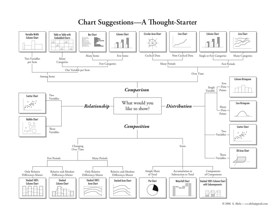 上面这张图很赞,描述所有图的用法